
In July, shadcn/ui changed its default. New projects no longer start on Radix — they start on Base UI, a library “from the creators of Radix, Material UI, and Floating UI” whose repository lives in MUI’s own GitHub organisation. So the most-searched React UI kit now runs, by default, on an engine built by the people behind Material UI.
That made the usual “shadcn vs MUI vs Mantine” question more interesting, and most comparisons I found still describe the old setup. So I built the same screen five ways — shadcn on Base UI, Radix and React Aria, plus MUI 9 and Mantine 9 — measured what each one ships, and wrote down every trap I hit on the way.
shadcn/ui vs MUI vs Mantine at a Glance
Versions, downloads and stars as of October 7, 2026, from npm, GitHub and each project’s docs. Weekly downloads cover September 28 to October 4.
| shadcn/ui | MUI (Material UI) | Mantine | |
|---|---|---|---|
| What you install | A CLI; component source is copied into src/components/ui |
@mui/material + @emotion/react + @emotion/styled |
@mantine/core + @mantine/hooks |
| Current version | CLI 4.21.3 | 9.4.0 | 9.7.1 |
| Last major | — (no versioned component package) | v9, announced April 8, 2026 (v8 was skipped) | 9.0 on March 31, 2026 |
| Behaviour underneath | Base UI (default), Radix or React Aria | MUI’s own components | Mantine’s own, with Floating UI |
| Styling | Tailwind CSS v4 classes in your copy | Emotion (CSS-in-JS) | A CSS file, also split per component |
| Look out of the box | Neutral; eight styles, Nova by default | Material Design | Mantine’s own neutral style |
| License | MIT | MIT core; MUI X Pro and Premium are commercial | MIT |
| GitHub stars | 125.2k | 99.1k | 31.8k |
| npm weekly downloads | 13.4M (the CLI) | 12.5M | 3.3M |
| My benchmark, gzip | 126.8–154.4 KB | 140.2 KB | 163.2 KB |
One caveat on the downloads: the shadcn package is the CLI, not the components. Your app never depends on it at runtime, so its number counts CLI runs — the primitives tell the usage story better: @base-ui/react had 19.3 million weekly downloads and radix-ui 19.1 million.
What Is shadcn/ui (and Why It Isn’t a Library)
Most component libraries work the same way: install a package, import Button, configure a theme. shadcn/ui doesn’t. Its introduction says it plainly: “This is not a component library. It is how you build your component library.”
When you run npx shadcn add dialog, the CLI writes dialog.tsx into your repo. From that moment it is your code:
- You edit it directly. Need a different close button? Change the file. No theme override, no wrapper, no
!important. - Nobody upgrades it for you. A bug fixed upstream stays in your copy until you pull it in. Registries help teams share their own versions — public GitHub repositories since June, private ones since August — but the trade-off remains.
- Coding agents can read it. shadcn markets this explicitly as “AI-Ready”: the source is in your repo, so an agent sees exactly what it is changing.
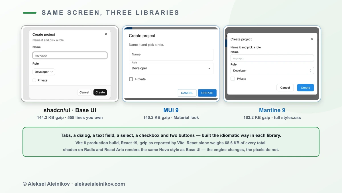
How much code do you take on? For the seven components in my benchmark, the CLI wrote 558 lines on Base UI, 581 on Radix and 925 on React Aria, which also pulled in an input group and a textarea as dependencies.
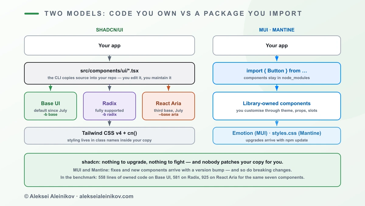
MUI and Mantine are the opposite model. Components stay in node_modules, you customise them through the theme, props and slots, and fixes arrive with npm update — together with any breaking changes.
“shadcn vs MUI” is not really a styling question. It’s a question of who owns the component code: you, or a vendor that ships updates you have to absorb.
The Benchmark: the Same Screen in Five Setups
To compare like with like, I built one screen in every setup: tabs, a “New project” dialog with a text field, a select and a checkbox, and two buttons — written the idiomatic way for each library.
- Toolchain: Vite 8.3 production build, React 19, TypeScript, default settings. Sizes are gzip as reported by Vite.
- shadcn: scaffolded with
shadcn init -t vite -p novaand-b base,-b radixor-b aria, thenshadcn addfor the seven components. These builds include the template’s icon library (lucide-react) and theme provider; web fonts are separate files and not counted. - MUI:
@mui/material9.4 with Emotion. Mantine:@mantine/core9.7.1 with the standardstyles.cssimport from its getting-started guide. - Baseline: the same Vite app with only React renders 68.6 KB gzip. Every number below includes it.
- Packages: I counted the distinct npm packages that ended up in the shipped JavaScript, using the build’s source maps.
| Setup | JS gzip | CSS gzip | Total | Over bare React | npm packages in bundle | Code you own |
|---|---|---|---|---|---|---|
| shadcn/ui + Radix | 118.7 KB | 8.1 KB | 126.8 KB | +58.2 KB | 48 | 581 lines |
| MUI 9.4 | 140.2 KB | — (runtime) | 140.2 KB | +71.7 KB | 24 | — |
| shadcn/ui + Base UI | 136.3 KB | 8.0 KB | 144.3 KB | +75.7 KB | 14 | 558 lines |
| shadcn/ui + React Aria | 145.4 KB | 9.0 KB | 154.4 KB | +85.9 KB | 12 | 925 lines |
| Mantine 9.7 | 127.3 KB | 35.9 KB | 163.2 KB | +94.6 KB | 18 | — |
What the numbers say:
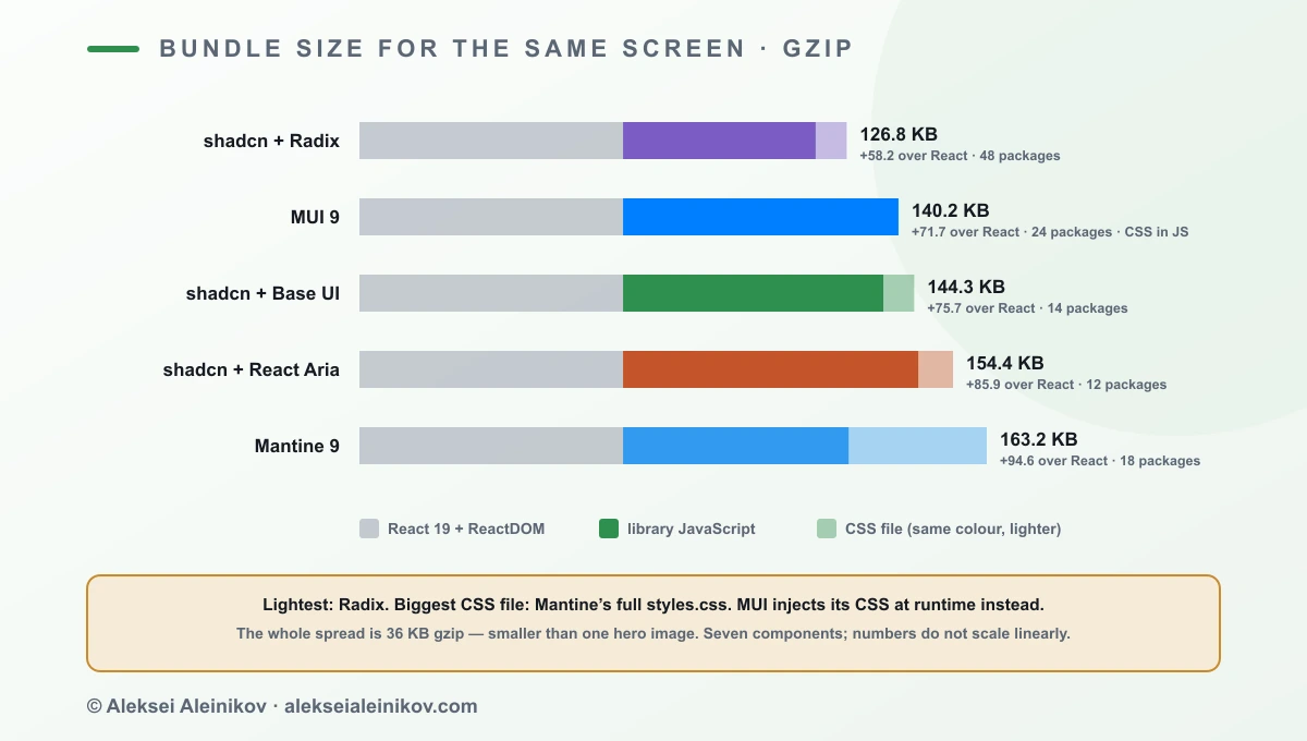
- Radix was the lightest, even though it ships the most packages. Radix publishes each component as its own independently versioned package — 48 packages ended up in this bundle — but each one is small.
- Base UI cost 17.6 KB more than Radix for these seven components, with a much shorter dependency list. That is the price of the new default on this screen; with a different component mix it can go either way.
- MUI ships no CSS file. Emotion generates styles in JavaScript at runtime, so its 140.2 KB is all JS — something to keep in mind for server rendering and strict Content Security Policies.
- Mantine’s JavaScript is the second-smallest at 127.3 KB, but the full
styles.cssadds 35.9 KB gzip of CSS for every component, used or not.
And the most important line: the whole spread is 36 KB gzip. That’s real on a slow phone, but it’s smaller than a single hero image. Bundle size alone shouldn’t decide this — ownership, design language and the components you’d otherwise build yourself should.
shadcn Radix vs Base UI vs React Aria: Which Base to Pick
“shadcn vs radix” is the most common shadcn comparison people search for, and it’s slightly the wrong question. Radix is one of three bases shadcn can now sit on. Here is what changed in 2026, according to the shadcn changelog:
- December 2025:
npx shadcn createlet you pick Radix or Base UI. Every component was rebuilt for Base UI with the same abstraction. - July 2026: Base UI becomes the default. The reasons shadcn gives: Base UI was stable at 1.6, past 6 million weekly downloads, and projects created on shadcn/create were already choosing it over Radix 2 to 1. It has since reached 1.8.0.
- July 2026: React Aria becomes a third base (
--base aria), available in all eight visual styles.
What did not change matters just as much: Radix is not deprecated. shadcn writes that every update and new component ships for both libraries unless a component only exists in Base UI, that it still runs Radix in production, and that you don’t need to migrate: “If your app works, keep shipping.”
| Base UI | Radix | React Aria | |
|---|---|---|---|
| shadcn status | Default since July | Fully supported | Third base since July |
| Init flag | -b base |
-b radix |
--base aria |
| Built by | Creators of Radix, Material UI, Floating UI | WorkOS | Adobe |
| Composition API | render prop |
asChild |
React Aria Components (id, defaultSelectedKey) |
| My benchmark, gzip | 144.3 KB | 126.8 KB | 154.4 KB |
| npm packages in bundle | 14 | 48 | 12 |
| Owned code, 7 components | 558 lines | 581 lines | 925 lines |
If you do migrate, shadcn deliberately didn’t ship a codemod — you’ve edited your copies, and a codemod would break exactly those. Instead there’s a skill for coding agents (pnpm dlx skills add shadcn/ui, then “migrate accordion to base-ui”). It works one component at a time, leaves one commit per component on a branch, and writes a report of behaviour changes to check by hand. shadcn’s own test: 60+ components, 36 on Radix, about 25 minutes at roughly 10,000 tokens per component.
The day-to-day API difference you’ll notice first is composition:
// Radix base: asChild<DialogTrigger asChild>  <Button>New project</Button></DialogTrigger>
// Base UI base: render prop<DialogTrigger render={<Button />}>New project</DialogTrigger>
MUI 9: What Changed
MUI went straight from v7 to v9, announced on April 8, 2026, to put Material UI and MUI X on one shared major version again. The things that matter for this comparison:
- New components and stricter accessibility.
NumberFieldandMenubarare new. Tabs, menus and steppers moved to proper rovingtabindexkeyboard navigation, and the stepper now renders as an ordered list. - Deprecated APIs are gone. The old
components/componentsPropsand*Propsprops are replaced byslotsandslotProps, and system props such as<Box mt={2}>must move intosx. MUI ships codemods for most of it — see the upgrade guide. - Higher browser floor: Chrome 117, Firefox 121 and Safari 17 are the new default targets.
- Emotion stays — for now. MUI says it will explore independence from Emotion and better Tailwind integration for the next major.
- MUI X got new pricing. Since April 8, Pro and Premium use per-application licensing, and telemetry for commercial components is on by default in development builds (off in production).
MUI’s real advantage isn’t the button. It’s MUI X: a Data Grid with server-side features, date and time pickers, charts, a tree view and, new in v9, Scheduler and Chat in alpha. If you’d otherwise spend weeks on a decent data grid, that alone can decide the comparison.
Mantine 9: The Batteries-Included Middle
Mantine sits between the two models: a full npm library like MUI, but with a neutral look and plain CSS instead of CSS-in-JS. Version 9.0 shipped on March 31, 2026; 9.7.1 came out on October 6.
- React 19.2 or newer is required —
@mantine/core9 declaresreact ^19.2.0as a peer dependency. If you’re stuck on React 18, Mantine 9 is off the table; MUI and Base UI still support React 17 and up. - Hooks come with it.
@mantine/hooks(for exampleuseDisclosure, which my benchmark dialog uses) covers a lot of what you’d otherwise pull from other packages. - CSS is a real file. That’s good for server rendering and caching. The default
@mantine/core/styles.cssimport is also the largest single item in my benchmark — 35.9 KB gzip — because it contains every component’s styles.
Mantine also ships per-component stylesheets (@mantine/core/styles/Button.css and so on) to trim that CSS. Do it carefully — see trap 5 below.
Five Traps I Hit Setting These Up
All of these come from building the benchmark on October 7, 2026, with the versions above.
shadcn init -b baseproduced a Radix project. With-t viteand no preset, the CLI wrote"style": "new-york"and installedradix-uidespite-b base. Adding a preset (-p nova) fixed it and gave"style": "base-nova". Checkcomponents.jsonafter init.- Base UI’s Select shows the raw value. With Radix,
<SelectValue />shows the selected item’s label (“Developer”). With Base UI it showeddevuntil I passeditemsto the root — the Base UI types document exactly that: whenitemsis specified,Select.Valuerenders the label instead of the raw value. - The React Aria template didn’t build out of the box. The generated
label.tsximportsReactwithout using it, and the Vite template’s strict TypeScript settings failtsc -bwith TS6133. Delete the import and it builds. - The React Aria API is different, not just the engine. Tabs use
idanddefaultSelectedKeyinstead ofvalueanddefaultValue, and the dialog nests insideDialogTrigger. Moving between bases is a real migration, not a flag. - Partial Mantine CSS fails silently. My first attempt at importing only the per-component stylesheets missed a few, and the tabs and buttons rendered completely unstyled — no error, no warning. If you split Mantine’s CSS, check every screen visually.
Which React UI Library Should You Pick?
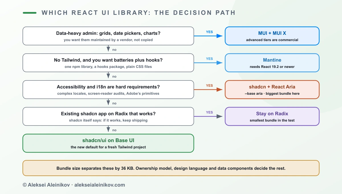
| Your situation | Pick | Why |
|---|---|---|
| Admin or analytics app with heavy tables, date pickers, charts | MUI + MUI X | Maintained data components you’d otherwise build; budget for Pro or Premium if you need advanced grid features |
| New Tailwind project, custom design system, coding agents writing UI | shadcn/ui on Base UI | You own the code; it’s shadcn’s recommended default |
| Existing shadcn app on Radix | Stay on Radix | Fully supported, smallest bundle in my test; migrate later with the skill if you want |
| No Tailwind, want one library with hooks and plain CSS | Mantine | Batteries included, neutral design — if you can be on React 19.2+ |
| Accessibility and internationalisation are hard requirements | shadcn/ui on React Aria | Adobe’s primitives — accept the largest bundle and the most owned code |
| You need Material Design specifically | MUI | It’s the reference implementation |
What About Chakra, DaisyUI, HeroUI and Headless UI?
They’re real options, just smaller in the current conversation. Weekly npm downloads for September 28 to October 4:
- Headless UI (8.8M) — Tailwind Labs’ unstyled components. Closer to Radix or Base UI than to shadcn: you still write all the styling.
- Chakra UI (2.0M) — a styled library with style props; similar in spirit to Mantine.
- Ark UI (1.2M) — headless components from the Chakra team.
- DaisyUI (1.2M) — a Tailwind plugin of CSS class names, no React components at all.
- HeroUI (0.8M) — formerly NextUI, a styled Tailwind-based library.
If you’re already comparing build tooling, my Biome benchmark, the es-toolkit vs lodash test and the Jest to Vitest migration guide use the same measure-it-yourself approach.
The Bottom Line
The three libraries are closer in size than their fans suggest — 36 KB gzip separates the lightest and heaviest setup in my test. What separates them is ownership. shadcn/ui hands you the code and, since July, puts it on Base UI by default; MUI and Mantine keep the code and hand you updates.
If your app lives on data grids, pick MUI. If you want one tidy library without Tailwind, pick Mantine. For a new Tailwind project, start with shadcn on Base UI — and if you already have shadcn on Radix and it works, take shadcn’s own advice and keep shipping.

From the community
Discussion on the Fediverse
Replies from Mastodon and Bluesky — straight from the open web, no tracking.
Loading replies …
No replies yet. Start the conversation:
Replies could not be loaded right now.