
Every comparison of Python plotting libraries turns into a gallery. Five pages of sample charts, all of them attractive, none of them telling you anything useful — because all five libraries can draw a bar chart, and all five bar charts look fine.
The question that actually decides which one you should use is dull and never on the gallery page: where does the chart get rendered, and where does your data end up when it does?
Answer that, and every quirk these libraries have stops being a surprise.
The Split That Explains Everything
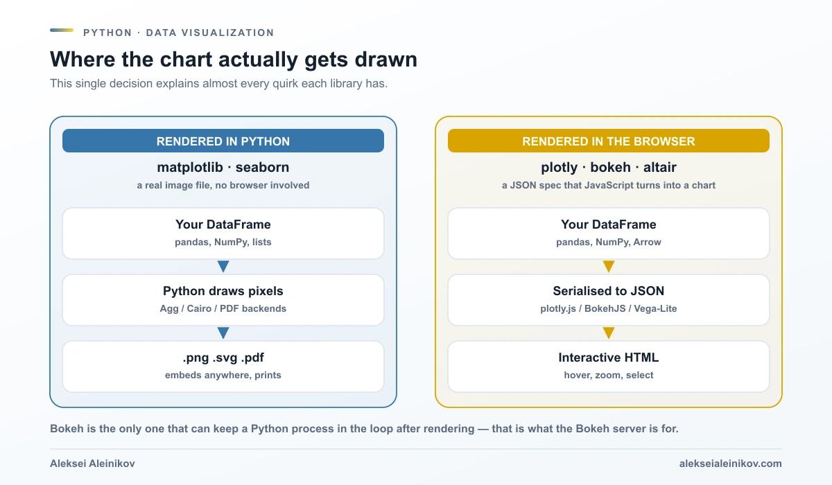
matplotlib and seaborn draw in Python. Your dataframe goes in, a rendering backend turns it into pixels or vectors, and you get a file. No browser is involved at any point. The output is a .png, .svg or .pdf that you can embed in a paper, attach to an email, or commit to a repository.
plotly, bokeh and altair draw in a browser. Your dataframe is serialised into a JSON description of the chart, and a JavaScript library — plotly.js, BokehJS, or Vega-Lite — reads that description and renders it. The output is interactive HTML: hover, zoom, select, all for free.
That single difference predicts the rest. It is why Altair has a row limit. It is why plotly needs a browser installed to write a PNG. It is why matplotlib feels clunky and also why it never breaks.
matplotlib — The Foundation Everything Else Stands On
matplotlib is not one of five options. It is the layer three of the others were built to avoid talking to directly.
It gives you complete control: every tick, every spine, every colour, every artist on the canvas is addressable. That control is also the complaint. A chart that seaborn produces in one line takes matplotlib five or ten, and the defaults have aged.
import matplotlib.pyplot as plt
fig, ax = plt.subplots(figsize=(7, 4))ax.plot(df["month"], df["revenue"], marker="o")ax.set_ylabel("Revenue (EUR)")ax.set_title("Monthly revenue")ax.grid(alpha=0.3)fig.savefig("revenue.pdf", bbox_inches="tight")
That last line is the reason matplotlib is not going anywhere. One call, and you have a vector PDF suitable for print. Nothing on the browser side of the split does that without extra machinery.
Use it when: the output must be a file, the layout must be exact, or you are already in matplotlib because something else dropped you there.
seaborn — Statistics, With matplotlib Underneath
seaborn is the highest-value library on this list for most people doing analysis, because it changes what you have to think about. Its documentation describes the API as dataset-oriented and declarative: you name the columns and their roles, and it handles the semantic mapping and the statistical aggregation.
import seaborn as sns
sns.set_theme()tips = sns.load_dataset("tips")
sns.relplot(    data=tips,    x="total_bill", y="tip", col="time",    hue="smoker", style="smoker", size="size",)
Five variables, one call, faceted into subplots, legend written for you. The equivalent in raw matplotlib is a loop and a lot of bookkeeping.
It also does real statistics rather than just drawing. When seaborn estimates a value it uses bootstrapping to compute confidence intervals and draws the error bars for you — relplot, displot and catplot cover relationships, distributions and categories respectively, and lmplot will fit and draw a regression with its uncertainty.
Two things to know before you rely on it.
The first is that seaborn does not replace matplotlib, it sits on it. The documentation is honest about the consequence: full customisation requires knowing matplotlib’s concepts, and part of the learning curve is recognising when you have to drop down a layer. Extra keyword arguments are passed through to the underlying matplotlib artists precisely so that you can.
The second is that sns.set_theme() is global. It writes to matplotlib’s rcParam system, which means it changes how all matplotlib plots look in that session — including plots you did not draw with seaborn. That is usually what you want, and occasionally a mystery worth ten minutes of confusion.
Use it when: you have a dataframe and a statistical question. Which is most of the time.
plotly — Interactive by Default
plotly is built on top of the plotly.js JavaScript library, covers over 40 chart types, and gives you hover, zoom and pan without writing any JavaScript. Its high-level API, Plotly Express, gets you there in one line.
import plotly.express as px
fig = px.scatter(    df, x="bill_length_mm", y="bill_depth_mm",    color="species", size="body_mass_g",    hover_data=["island"],)fig.write_html("penguins.html")
Open that HTML anywhere and you can hover a point to read its values. For sharing exploratory results with people who are not going to run your notebook, that is a genuine step change over sending a PNG.
The constraint is on the way out. plotly exports static images through Kaleido, and Kaleido requires Chrome or Chromium to be installed to generate them — if it cannot find one, there is a plotly_get_chrome command to install it. So an interactive chart is free, and a PNG for your report drags a browser into your build pipeline. Worth knowing before you standardise on it for anything that gets printed.
For full web applications, plotly pairs with Dash, which is a separate framework rather than a feature of the plotting library.
Use it when: the audience will interact with the chart, and the deliverable is a web page rather than a document.
bokeh — The One That Keeps Python in the Loop
On the surface bokeh overlaps heavily with plotly: browser rendering, interactivity, widgets. The difference is architectural and it is the whole reason to choose it.
The Bokeh server lets you build interactive web applications that are connected to Python code running on a server. With plotly, the interactivity lives entirely in the browser — the chart knows what you gave it and nothing more. With a bokeh server app, moving a slider can call a Python function, which can query a database, recompute, and push new data back into the chart.
from bokeh.plotting import figure, curdocfrom bokeh.models import Slider, ColumnDataSourcefrom bokeh.layouts import column
source = ColumnDataSource(data=dict(x=[], y=[]))p = figure(height=350, title="Live query")p.line("x", "y", source=source)
def update(attr, old, new):    source.data = run_query(window=slider.value)   # real Python, on demand
slider = Slider(start=1, end=90, value=30, title="Days")slider.on_change("value", update)curdoc().add_root(column(slider, p))
That runs with bokeh serve app.py. Which is also the cost: a Bokeh server application is a running process, not a file you email. If nobody is going to host it, you do not need bokeh.
Use it when: interaction has to trigger real Python — live data, expensive queries, models that cannot ship to the browser.
altair — Describe the Chart, Not the Drawing
Vega-Altair is a declarative library based on Vega and Vega-Lite. The idea is precise: you declare links between data columns and visual encoding channels — x, y, colour, size — and everything else is handled automatically.
import altair as altfrom altair.datasets import data
cars = data.cars()
alt.Chart(cars).mark_point().encode(    x="Horsepower",    y="Miles_per_Gallon",    color="Origin",).interactive()
That is the whole chart, and .interactive() makes it pan-and-zoomable. Where altair pulls ahead is composition: faceting, layering and concatenating charts are grammar operations rather than layout code, so going from one chart to a grid of twelve is a small edit instead of a rewrite.
The famous constraint follows directly from the design. Because altair produces a specification containing the data, not pixels, every row is serialised into the output. Try to plot more than 5,000 rows and you get:
MaxRowsError: The number of rows in your dataset is greater than the maximum allowed (5000).This is deliberate. Embedding a large dataset produces enormous notebooks, slow page loads, and transforms evaluated in JavaScript on data that had no business leaving Python. The ways out, in rough order of how often they are right:
- Pre-aggregate in pandas and send summary statistics instead of raw rows.
- Enable VegaFusion —
alt.data_transformers.enable("vegafusion")— which evaluates transformations in Python first and raises the ceiling to 100,000 rows, and also strips unused columns. - Pass the data by URL so it is fetched rather than embedded.
- Disable the check with
alt.data_transformers.disable_max_rows()when you genuinely mean it.
Use it when: you are making many related charts, and conciseness and composability matter more than pixel-level control.
Which One, For What
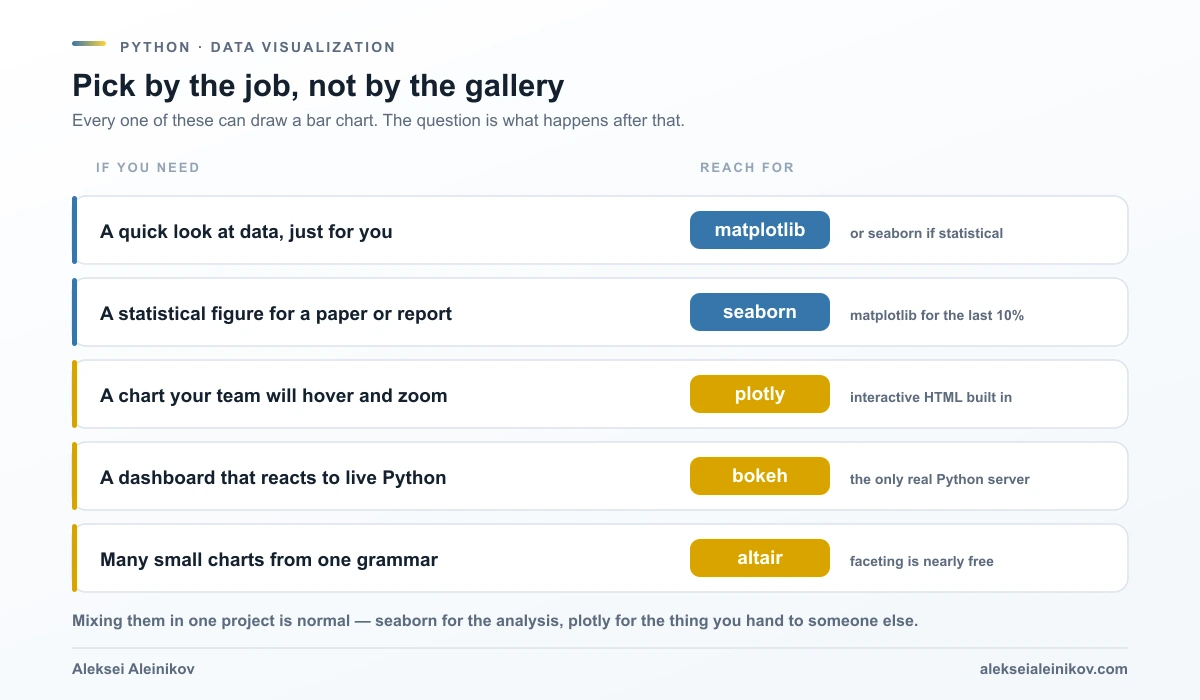
Mixing them is normal. seaborn during analysis and plotly for the thing you hand to a stakeholder is a perfectly coherent stack, not indecision.
The One Constraint Each Carries
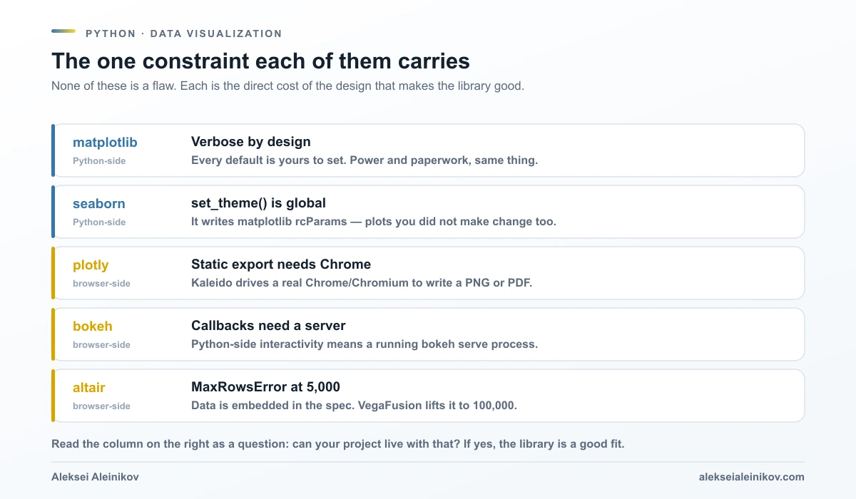
Read each of these as a question rather than a warning. Can this project live with a running server process? Can the build pipeline have Chrome in it? Is the dataset small enough to travel to a browser, or should it have been aggregated first anyway?
If the answer is yes, the constraint is not a problem. It is just the shape of the tool.
What I Would Actually Do
If you are starting today and want one answer rather than five: learn seaborn first, and learn matplotlib on demand when seaborn will not bend. That covers the large majority of real analysis work, produces files you can put in documents, and has no infrastructure attached.
Add plotly the first time someone asks “can I hover over that?”. Add altair if you find yourself producing many variations of the same chart. Add bokeh only when interaction genuinely has to run Python — and if you are not sure whether it does, it does not.
The gallery will not tell you any of this, because every library’s gallery is the same five charts, drawn well.
If you want to go deeper on the visualisation side specifically, I wrote a book about it — Prompting Python Data Visualization (Orange Education, 2026) — which covers the design decisions behind these charts rather than just the syntax. For the engineering around the analysis, the pytest in practice guide covers testing the code that produces the numbers, and joblib covers getting through a dataset large enough that plotting it is the easy part.
From the community
Discussion on the Fediverse
Replies from Mastodon and Bluesky — straight from the open web, no tracking.
Loading replies …
No replies yet. Start the conversation:
Replies could not be loaded right now.